Wednesday, 30 May 2012

Be Patient and You Will Find It

These are the two armchairs that sit in the corner of my dining room.  I bought them over 10 years ago from Carina Sherlock.  My dining room table only has 6 chairs, so I use these armchairs on the end when we want to seat 8.


Years ago I saw a picture in a magazine that had the same chairs but with big comfy seat cushions on them.  What a great idea - the seats are rattan and a bit low, so a cushion provides comfort and means you sit higher.


These seat cushions have been on my 'To Do' list for years.  I have looked in many shops for something to fit.  I even went to Melbourne and looked in the Carina Sherlock showroom, but no, they didn't have any.  I toyed with the idea of making them myself, but it would be very time consuming, especially with the piping.  I even thought about getting some professionally made but the cost would be prohibitive.

Finally, on a recent trip to IKEA, I spotted the DJUPVIK seat cushion for their wicker armchairs.  I wonder if they'd fit my chairs?  And guess what - they did!  Even better these cushions cost $30 each and have a removable cover for easy washing.


After 10 years, the paintwork on the chairs had discoloured and had spots on it.


I thought about painting them, but decided to sand them and give them a slightly more distressed feel.  The sanding removed the spots but added some character.


So this is how the chairs fit into the room. 
One day we want to change the window at the end to French doors.


My dilemma now is what sort of scatter cushions/pillows to put on the chairs?  The scatter cushions need to be either a small square or rectangle.

The only other piece of furniture in the room is the buffet.


The display changes from time to time, but the blue and white china is a constant.


There is also quite a bit of blue and white scattered around the room.


The chair pads on the other dining chairs are charcoal.  I tried having white seat pads, but with two kids it didn't really work.


So do I add cushions in blue & white in keeping with the china, or do I try to link in the charcoal seat pads?


This cushion from Linen House would link the charcoal.

Lhvint_amour_30x30_cushion

or this blue and white fabric from Fabric Traders might work with the blue and white china?

Madison in Blue by Premier Prints

Please let me know what you think.  After waiting 10 years for the seat cushions I don't want to wait another 10 years for the decorative cushions.


Asking for help here - Faded Charm, My Romantic Home, French Country Coattge

Monday, 21 May 2012

A Lovely Laundry

I would really like a lovely laundry.  One like this.

Pinned Image

or this

Pinned Image

or even this

Pinned Image

My laundry is seriously the size of a postage stamp.  You can just barely put the ironing board up.  It's so small I have a washing/dryer combination machine as there isn't enough room for both.  I'm trying to think of ways to pretty it up a bit.  At the moment I have a plastic laundry trough.  One day I'd like to replace it with something like this.

Pinned Image

or this

Pinned Image

or this

Pinned Image
I need hanging space for the ironing.

Pinned Image

Some laundry baskets to hide all the washing.

Pinned Image

and a pretty way to store all the cleaning supplies.

Pinned Image


Pinned Image


Pinned Image

OK - I'm off to work my way through the pile of washing and ironing that continues to grow in the laundry and see how I can transform the postage stamp into a lovely laundry.

All photo credits can be found at pinterest here.

Tuesday, 15 May 2012

My Home Office Bookcases

Previously I shared some photos of bookcases and decided the key to creating a good display was a mix of horizontal and vertical piles of books broken up with displays of memorabilia and photo frames.


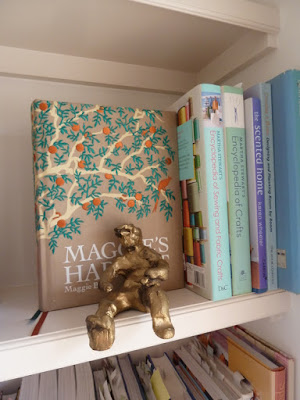
This little gold man was made by my son in grade 5.

Years ago we built some shelves in the alcoves either side of the door that leads from the home office to the hallway.  It's the first thing you see when you walk into the house from the garage, so I wanted it to look nice.


I started by dividing the books into groups - novels, biographies, travel, cooking, decorating etc...  Then I gathered together some photos and memorabilia.  Here's the end result.


The right hand side houses gardening, cooking, decorating and travel books.
I tried to arrange the books by colour within each group.


The left hand side has novels, biographies and reference books.


I created a little spiritual area or what I call my mental health shelf - with a Thai temple, Buddha, the keys to happiness, a little map in a frame of where we lived in London and the number 2 from our house here in Brisbane.


This is a shelf to remind me to be grateful for the travel I've done - the orange trams in Lisbon, Park Guell in Barcelona, the floating market in Thailand.


My husband is a bit of a cricket fan and we have a whole shelf of cricket books.


and of course, I have my fair share of decorating and entertaining books.


I've tried to add bits and pieces across the shelves to make them interesting.


A Portugese spinning top.

A miniature canoe that my Dad built. He then built a real one!


I'm really happy with the way it turned out. 
Now I have one more set of shelves to organise.


Tuesday, 8 May 2012

Bookcase Displays

How do you display items on a bookshelf so that they are both organised and appealing?

I love this display from The White Shed, but I have too many books for such a simple display.


This one is all books - pretty and practical. 


Source: houzz.com via Stylish on Pinterest

I like the use of photos in this one.


This one is done by colour.  Ive also seen shelves where the books are turned to show the white pages rather than the spine.  This helps the shelf look neater but how do you find the book you're after?  I'm too practical for that.

This bookcase has both vertical and horizontal piles of books that are broken up with interesting display items and photo frames.

Source: bhg.com via Kara on Pinterest

Here Martha Stewart has hidden everything in boxes and files to create a uniform look.  Probably a bit too matching?


Here's another example of vertical and horizontal books broken up with memorabillia and photos. 


 I think this is the key for me to create my bookcase display.  Let's see how it goes.


Thursday, 3 May 2012

Creative Space - Stylish Storage

A creative workspace needs to be both functional and inspiring.  I wanted to be able to store all my crafty bits and pieces but still have the room look nice as it is in the open landing area upstairs.

To start with I installed a couple of IKEA shelves on the wall above where the work table sits.


Then I filled the shelves with an assortment of boxes, caddys and baskets for storage.


 Rolls of ribbon in a white wire caddy.  Spray cans and pencils in a wooden one.


Glass jars filled with buttons and diamante (rhinestone) buckles.


Small white baskets from IKEA labelled with white clay tags.  IKEA boxes with label plates.  The word inspire was from Spotlight and I painted it white.


A tall woven basket from Freedom filled with wrapping paper.


Gift tags kept in a letter holder with a roll of natural twine.

It really is a joy to sit at my work table.
Related Posts Plugin for WordPress, Blogger...